
It looks so boring right now
Favicon!
Re: Favicon!
I could tryjacek wrote:If you make me one

Re: Favicon!
A favicon would be sweet. I'd love to make one for you.
I'll post some later tonight
I'll post some later tonight
Re: Favicon!
Ye you do it. Icons aren't my thingTemor wrote:A favicon would be sweet. I'd love to make one for you.
I'll post some later tonight
Re: Favicon!
I'm not pro either, but I can handle Photoshop well enough to give it a try atleastEcazS wrote:Ye you do it. Icons aren't my thingTemor wrote:A favicon would be sweet. I'd love to make one for you.
I'll post some later tonight
Re: Favicon!
Here's a few icons I just did.(really quick, sloppy ones.)
Let me know if you find one you "like" and any changes you would like me to make.
1)
2)
3)
4)
Of course, I could make something thats not just a background with PHP written on it, so hit me with any ideas.
Let me know if you find one you "like" and any changes you would like me to make.
1)
2)
3)
4)
Of course, I could make something thats not just a background with PHP written on it, so hit me with any ideas.
Re: Favicon!
I think number 3 is best out of those,
you could try the "<?" tag, but that might no look that good.
you could try the "<?" tag, but that might no look that good.

Re: Favicon!
I tried that, but the "<" sign gets really messed up. I'll try to find a way to get it in there and still look "ok".jacek wrote:I think number 3 is best out of those,
you could try the "<?" tag, but that might no look that good.
Re: Favicon!
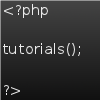
I did one, but it took up most of the favicon and therefore I could only fit "<?ph"jacek wrote:was just an idea, not that important really.
Re: Favicon!
Just the <? would do everyone will know what follow
EDIT: for now I went with number 3.
EDIT: for now I went with number 3.
Re: Favicon!
Like this?jacek wrote:Just the <? would do everyone will know what follow
EDIT: for now I went with number 3.
Can redo, of course.
Re: Favicon!
hmm, that's the style I was thinking of, but there could be a bit more style.
the first one, combined with the third one from before would be good
The pixel limit seems obvious.
the first one, combined with the third one from before would be good
The pixel limit seems obvious.
Re: Favicon!
jacek wrote:hmm, that's the style I was thinking of, but there could be a bit more style.
the first one, combined with the third one from before would be good
The pixel limit seems obvious.
I think this looks really bad...
This is about as round as I can make it without it looking too weird.
Last edited by Temor on Sat May 07, 2011 12:58 am, edited 2 times in total.
Re: Favicon!
Updated my previous post.jacek wrote:Perhaps slightly rounded corners would be a nice touch too.
I'm going to bed now, but I'll redo anything if you want me to as soon as I wake up.
Re: Favicon!
Thanks so much for doing that !
http://shiftrage.org/favicons/favi3.ico this one is pretty much perfect.
If its not too much trouble though, could you try the text centred, and perhaps a little darker.
http://shiftrage.org/favicons/favi3.ico this one is pretty much perfect.
If its not too much trouble though, could you try the text centred, and perhaps a little darker.
Re: Favicon!
jacek wrote:Thanks so much for doing that !
http://shiftrage.org/favicons/favi3.ico this one is pretty much perfect.
If its not too much trouble though, could you try the text centred, and perhaps a little darker.